
Streets Won’t Forget Christian Dada AW17 — ‘BLUE’
Christian Dada AW17 Look Six
Christian Dada exists at a paradoxical crossroads. The “Christian” in the brand’s name is an ode to the highest of Parisian high fashion, a la Christian Dior. The Dada is a reference to Dadaism, an early 19th century art movement that rejects the reason and aesthetics of contemporary capitalistic society. Christian Dada takes these two contradictory ideas and provides fresh twists in traditional designs, seeking to critique these garments and many of the other norms and practices of fashion. The brand itself takes all of these aspects to find beauty in imperfection.
This show interprets and draws inspiration from Ryu Murakami’s 1976 novel Almost Transparent Blue, which is a sharp, clear-eyed depiction of a group of friends caught in a emotionless, soulless circle of drug addiction. The novel is a stunning parallel to the work of Dada’s designer Masanori Morikawa; the novel, while brutal and violent, is also off puttingly beautiful. Morikawa channels this sort of ugly beauty of drugs in this collection through sayings such as “I don’t like the drugs, but the drugs like me.” This is the influence of Dadaism on Morikawa’s perception of rebellion; it’s angry, yes, but also defeatist and self-resigned. Many, many brands attempt to explore this sort of rebellious aspect of youth culture, but few are able to do so as naturally as Chrisitian Dada.

Christian Dada AW17 Look One
The opening look of the show captures the Christian Dada look by pairing loafers and a suit jacket on top of pajamas. It takes the formal suiting of high fashion and throws a wrench in it by putting it over pajamas, yet is able to do so without looking sloppy. The use of different fabrics on the jacket is done so as to expose the specific workings of the jacket. The pinstripe fabrics highlight the placement of specific pockets and zippers, which are traditionally placed to blend in with the garment as seamlessly as possible, pun fully intended. Additionally, the jacket doesn’t button at the middle, but rather folds over like a kimono.

Christian Dada AW17 Look Two
Look two follows the same idea, but works in the color blue in its loafers. The splash of color immediately stands out, highlighting the specific hue of blue utilized. This shade of blue is an ode to Derek Jarman’s 1993 film Blue, which depicts Jarman’s experiences with AIDS next to an exploration of the color blue. The film is an allegory of director Jarman’s loss of vision that left him only able to see blue, which is why the film is solely a blue screen. While this seems to put the visual component on the backburner of the story, viewing the film on a large screen causes your eyes to overcompensate for the color adjustment, playing tricks on your vision as you see random shapes and shades of orange the longer you watch.
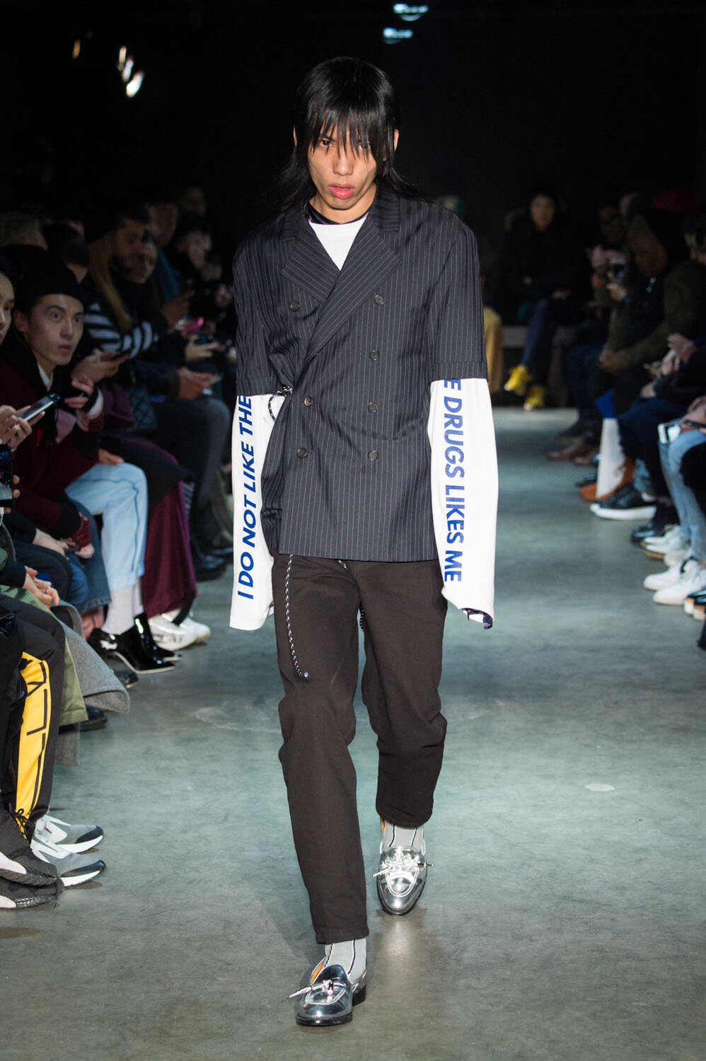
Christian Dada AW17 Look Three
Look three is a play on prehistoric e-boy attire, with the model wearing a short sleeved, double breasted pinstripe trench coat on top of a long sleeve shirt, with the sleeves displaying the slogan “I don’t like drugs, but drugs like me” in the same blue font of Derek Jarman. This outfit is then paired with a pair of chrome loafers, and a 2006 Pete Wentz haircut.

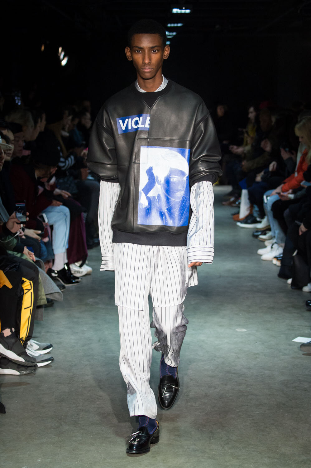
Christian Dada AW17 Look Six
Look six continues the conventional-clothes-over-pajamas look, this time placing a leather overshirt with the sleeves rolled up to remind you that it’s over pajamas. The overshirt also contains a cyanotype print, as well as half of the word “violence,” as if to rehash the themes and struggles of Almost Transparent Blue. Look eight finishes the use of pajamas with the most stark look, showcasing a knee length fur coat over the same pinstripe pajamas.

Christian Dada AW17 Look 11
Look eleven is one of the standouts of the collection, utilizing an exaggeratedly long chrome puffer scarf over one of Dada’s most wearable looks. The pinstripe pants hover in the space between slim and skinny, sitting perfectly cropped over the model’s blue loafers. The oversized t-shirt over a long sleeve shirt seems to be a call back to the “drugs” slogan of look six, this time simply saying “silence,” as if the model has helplessly conceded to their drug usage. This look is also rehashed in look 32, this time in womens, with the model instead wearing a plaid skirt reminiscent of Burberry’s check, except with a blue line. The model’s t-shirt also contains the phrase “Blue is the,” which is then abruptly cut off where the shirt is tucked in. The abruptness of this outfit, and the blue accent running throughout, seems to me to call to the suddenness and fleeting nature of life, especially when dealing with hard drugs.

Christian Dada AW17 Look 13
The show continues with two bomber jackets that are specifically designed to display the garment’s skeleton. Each pattern piece on the center of the jacket is made of a different color, almost like a paint-by-numbers that’s gone horribly wrong, which again adheres to the brand’s idea of beauty in imperfection.

Christian Dada AW17 Look 18
The blue is rehashed in a stunningly clean overcoat in look 18, which also displays the word “Paranoia,” which is another essential theme of Almost Transparent Blue. The coat’s shape is reminiscent of Engineered Garments, but without a plethora of pockets to distract from a gorgeous silhouette. This look is then followed by a hockey sweater with the word “Heroin” written in the classic Coca-Cola font. This, more than any other garment in the collection, is the perfect distillation of Dadaism. It takes an icon of capitalism, questioning it by taking a drug that’s used to fight the negative side effects that come with consumerism. It’s such a simple, yet thoughtful piece, yet if I saw it in the wild, I would almost assume it’s a peak Vetements piece.
Sometimes when discussing drug usage, designers are forced to reckon with the potential ham-fistedness about the presentation of their message. As fashion journalist Bliss Foster points out in his review of Raf Simons’ A/W 2018 collection, the topic of drugs just makes people uncomfortable, and if a piece of art is trying to discuss this subject, you have to ask yourself why you’re so closed off to it, and why drug references often seem so on the nose. But in a sense, you have to be this direct. It’s not really a topic you can hide through metaphor. And while Morikawa may directly allude to paranoia and other topics, he does so through the lens and backing of a novel that’s able to provide a much more eloquent explanation than can be provided on clothes. There’s a simplicity in these references which allows Morikawa to reference this drug usage in a way that is far from glorifying its usage.

Christian Dada AW17 Look 35
The show closes with perhaps its most simple, yet on brand look; an oversaturated shearling coat, complete with a sort of shearling neck collar and a “Too fast to live, too young to die” shirt, tying together all the themes and ideas of Christian Dada as a brand.
Over three years have passed since this collection was shown, and although Christian Dada is now a regular at Paris Fashion Week, the brand still hasn’t really gotten its flowers from the mainstream, or from the elevated streetwear-heads it could be calling its fans. There isn’t necessarily a look to it that is definitively Dada, but its runway shows are well thought out and are remarkably on trend. It does feel like a bit of a missed opportunity; there’s no true fashion brand that epitomizes the self-referential, anti-art ideas of Millennial Dadaism, especially since Vetements has more or less exited the playing field. Regardless, this is a collection that caught me by surprise, and it’s one that needs to be treasured.